Styling Remix using Vanilla CSS

How to style a Remix app using Plain CSS

Wednesday, December 1, 2021

coloring pencils

Table of Contents

TL;DR: Source and Demo

Link to the source code

Here's a live demo

Introduction

In my last blog post, I discussed how to perform a CRUD operation in a Remix app. In this blog post, I will discuss how to style a Remix app using only plain CSS.


Why to use plain CSS?

According to the official documentation

In general, stylesheets added to the page with <link> tend to provide the best user experience:

  • The URL is cacheable in browsers and CDNs
  • The URL can be shared across pages in the app
  • The stylesheet can be loaded in parallel with the JavaScript bundles
  • Remix can prefetch CSS assets when the user is about to visit a page with <Link rel="prefetch">.
  • Changes to components don't break the cache for the styles
  • Changes to the styles don't break the cache for the JavaScript

Cleaning up styles from boilerplate

bash
12# Remove all files under `app/styles`rm -r app/styles/*

Global Styling


Recreate the app/styles/global.css file

Some CSS defaults I copied from the official documentation with some adjustments.

app/styles/global.css
1234567891011121314151617181920212223242526272829303132333435363738394041424344:root { --color-foreground: hsl(0, 0%, 0%); --color-background: hsl(0, 0%, 100%); --color-primary: hsl(230, 100%, 50%); --color-primary-light: hsl(230, 100%, 60%); --color-primary-dark: hsl(230, 100%, 40%); --color-gray-dark: hsl(0, 0%, 60%); --color-gray-light: hsl(0, 0%, 90%); --font-body: -apple-system, "Segoe UI", Helvetica Neue, Helvetica, Roboto, Arial, sans-serif, system-ui, "Apple Color Emoji", "Segoe UI Emoji";} html { box-sizing: border-box;} *,*::before,*::after { box-sizing: inherit;} html,body { padding: 0; margin: 0; background-color: var(--color-background); color: var(--color-foreground);} body { font-family: var(--font-body); line-height: 1.5;} a { color: var(--color-primary-light); text-decoration: none;} a:hover { color: var(--color-primary-dark); text-decoration: underline;}

We'll modify app/root.tsx to import the global stylesheet; then, export the style in a links function.

app/root.tsx
12345678910111213import type { LinksFunction } from "remix";import styles from "~/styles/global.css"; export const links: LinksFunction = () => { return [ { rel: "stylesheet", href: styles, }, ];}; // ...

After Adding the links function, nothing changes in the app. If we check the elements inspector, there is no link tag inside the <head> tag.
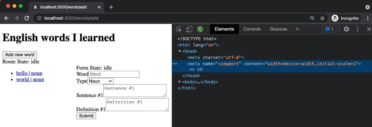
An image of a blog post

Add Links to head

Since Remix will only do what we tell it to do, we need to inform it to render the links we exported in our pages using the Links compnent.

app/root.tsx
123456789101112131415import {/*other imports*/, Links} from "remix"; // The function containing the HTML declarationfunction Document({/*props*/}) { return ( <html lang="en"> <head> {/* This is the magic piece */} <Links /> {/*...*/} </head> {/*body content*/} </html> );}

The changes above will yield to:

An image of a blog post

TRIVIA: We can technically put <Links/ > anywhere inside the html tag; however, here's a reason why you should not do it.


Styling a Route

For now, we're not aiming to get the best design award; we'll just apply some styles for the sake of making it look different.

Create the /words route styles

app/styles/words.css
12345678910111213.words__page { margin: 1rem; padding: 1rem; border: 1px solid black;} .words__content { padding: 0.5rem; border: 1px solid var(--color-gray-dark); display: grid; grid-template-columns: 1fr 1fr; border-radius: 3px;}

Add class name definition inside the component

app/routes/words.tsx
123456789101112131415// ... export default function Index() { // ... return ( <div className="words__page"> {/*...*/} <div className="words-content"> {/*...*/} <Outlet /> </div> </div> );}

export the links function

app/routes/words.tsx
1234567891011121314// ...import type { LinksFunction } from "remix";import styles from "~/styles/words.css"; export const links: LinksFunction = () => { return [ { rel: "stylesheet", href: styles, }, ];}; // ...

The changes above will yield to:

An image of a blog post

NOTE: every child route of /words will inherit the styles exported in app/routes/words.tsx


Styling a child Route

Since both our /add and /edit/$id routes use a form, let's create a shared css file.

I'm too lazy to think of a great design. Let's simply add a border.

app/styles/words/shared.css
12345form { border: 1px solid var(--color-gray-dark); padding: 0.5rem 1rem; border-radius: 3px;}

Now, let's expose the style by exporting it in our links function.

app/routes/words/add.tsx
1234567891011// ...import sharedStyles from "~/styles/words/shared"; export const links: LinksFunction = () => [ { rel: "stylesheet", href: sharedStyles, },]; // ...

Here's the result:

An image of a blog post

After clicking the Add new word button, the word form will be styled as expected. However, since the Add new word is inside a form as well, that form will also have a border.


A straightforward way to fix this is to improve the specificity of the word form by adding a class name.

app/styles/words/shared.css
12345form.word-form { border: 1px solid var(--color-gray-dark); padding: 0.5rem 1rem; border-radius: 3px;}
app/components/WordForm.tsx
123456789// ...export function WordForm({ word }: { word?: Word }) { // ... return ( <Form method="post" className="word-form"> {/*...*/} </Form> );}

After adding the class name, our word form styles won't leak to other form elements.

An image of a blog post

Sibling Routes Styling

I'm adding a temporary background color to demonstrate how sibling routes styling behave.

app/styles/words/shared.css
12345678form.word-form { border: 1px solid var(--color-gray-dark); padding: 0.5rem 1rem; border-radius: 3px; /* Temporary style */ background-color: red;}
An image of a blog post

After navigating from /add to /edit/$id, the word form styling is removed in the head; The reason why styles were not applied to the /edit/$id form.

The reason is simple; sibling routes do not share styles with other sibling routes.


To fix the issue, we need to apply similar change to app/routes/words/edit.$id.tsx

app/routes/words/edit.$id.tsx
1234567891011// ...import sharedStyles from "~/styles/words/shared.css"; export const links: LinksFunction = () => [ { rel: "stylesheet", href: sharedStyles, },]; // ...

Now it's working as expected. There's no magic or whatever, just pure JavaScript doing its thing.

An image of a blog post

Styling a reusable component

Revert changes in app/styles/words/shared.css, app/routes/words/add.tsx, and , app/routes/words/edit.$id.tsx

We were able to share styles between sibling routes. However, this is not the right approach for this app.

The change we made was specific to a form and not a page, so we'll make the changes in the word form component.


Create a new folder word-form under app/components

Create the word form styles
app/components/word-form/styles.css
123456789101112.word-form label { font-size: 0.8em;} .word-form { display: flex; flex-direction: column; gap: 0.5rem; padding: 1rem; border: 1px solid var(--color-gray-dark); border-radius: 0.5rem;}

Rename WordForm.tsx to index.tsx and move it to app/components/word-form

Export the declaration of our links magic function

app/components/word-form/index.tsx
1234567891011121314151617import type { LinksFunction } from "remix";import styles from "./styles.css"; export const links: LinksFunction = () => [ { rel: "stylesheet", href: styles, },]; export function WordForm({ word }: { word?: Word }) { // ... return ( <Form method="post" className="word-form"> {/*...*/} </Form> );

Uh oh! The styles are not applied to the word form component. Now, we only have 2 link tag in the head

An image of a blog post

It seems the magical behavior of export const links only applied to routes

To fix the issue, we need to propagate the styles to a route

app/routes/words/add.tsx
123456import type { LinksFunction } from "remix";import { WordForm, links as formStyles } from "~/components/word-form"; export const links: LinksFunction = () => [...formStyles()]; // ...

Apply the same thing in app/routes/words/edit.$id.tsx

The changes above will yield to:

An image of a blog post

Styling custom basic HTML Element

Q: So how do we style a custom basic HTML element using CSS?

A: The same as for word form. Although, we need to propagate more until the reference reaches a route.

Custom Button

app/components/basic/button/index.tsx
123456789101112131415161718192021import React from "react";import styles from "./styles.css";import type { LinksFunction } from "remix"; export const links: LinksFunction = () => [ { rel: "stylesheet", href: styles, },]; type CustomButtonProps = { color?: "primary" | "success" | "danger" | "warning" | "info";}; export const Button = React.forwardRef< HTMLButtonElement, JSX.IntrinsicElements["button"] & CustomButtonProps>(({ color, ...props }, ref) => ( <button {...props} ref={ref} custom-button={color ? color : ""} />));
app/components/basic/button/styles.css
12345678910button[custom-button] { display: block; height: 2rem; color: #000000;} button[custom-button="primary"] { background-color: var(--color-primary); color: #ffffff;}

Other custom elements

There is nothing fancy for other elements, so you can view the sources here for input, select, and textarea.


Here is how we can propagate the components used in the word form to the routes

app/components/word-form/index.tsx
12345678910111213141516171819// ...import { Input, links as inputLinks } from "../basic/input/Input";import { Select, links as selectLinks } from "../basic/select/Select";import { TextArea, links as textAreaLinks } from "../basic/textarea/Textarea";import { Button, links as buttonLinks } from "../basic/button/Button";import styles from "./styles.css"; export const links: LinksFunction = () => [ ...inputLinks(), ...selectLinks(), ...textAreaLinks(), ...buttonLinks(), { rel: "stylesheet", href: styles, },]; // ...

New Word Form Component

After replacing the default html elements with our custom ones, our word form will look like this:

app/components/word-form/index.tsx
1234567891011121314151617181920212223242526272829303132333435363738394041424344454647484950515253545556575859606162636465666768697071727374757677787980818283848586878889909192import type { LinksFunction } from "remix";import { useTransition, Form } from "remix";import { Word, WordType } from "~/models/word";import { Input, links as inputLinks } from "../basic/input/Input";import { Select, links as selectLinks } from "../basic/select/Select";import { TextArea, links as textAreaLinks } from "../basic/textarea/Textarea";import { Button, links as buttonLinks } from "../basic/button/Button";import styles from "./styles.css"; export const links: LinksFunction = () => [ ...inputLinks(), ...selectLinks(), ...textAreaLinks(), ...buttonLinks(), { rel: "stylesheet", href: styles, },]; export function WordForm({ word }: { word?: Word }) { let transition = useTransition(); return ( <Form method="post" className="word-form"> <div>Form State: {transition.state}</div> <div> <label htmlFor="name">Word</label> <Input id="name" name="name" type="text" placeholder="Word" required defaultValue={word?.name ?? ""} disabled={Boolean(word?.name)} /> </div> <div> <label htmlFor="type">Type</label> <Select id="type" name="type" defaultValue={word?.type ?? WordType.NOUN} > <option value={WordType.NOUN}>Noun</option> <option value={WordType.VERB}>Verb</option> <option value={WordType.ADJECTIVE}>Adjective</option> </Select> </div> <div> {word?.sentences.map((sentence, i) => ( <SentenceField index={i + 1} sentence={sentence} key={i} /> )) ?? <SentenceField index={1} sentence={""} />} </div> <div> {word?.definitions.map((definition, i) => ( <DefinitionField index={i + 1} definition={definition} key={i} /> )) ?? <DefinitionField index={1} definition={""} />} </div> <Button type="submit" color="primary"> Submit </Button> </Form> );} const SentenceField = ({ index, sentence }: any) => ( <div> <label htmlFor={`sentence.${index}`}>Sentence #{index}</label> <TextArea id={`sentence.${index}`} name="sentence" defaultValue={sentence} placeholder={`Sentence #${index}`} minLength={10} /> </div>); const DefinitionField = ({ index, definition }: any) => ( <div> <label htmlFor={`definition.${index}`}>Definition #{index}</label> <TextArea id={`definition.${index}`} name="definition" defaultValue={definition} placeholder={`Definition #${index}`} minLength={10} /> </div>);

The changes above will yield to:

An image of a blog post

Dark Mode

There are many ways to implement dark mode. This example will use prefers-color-scheme to update the CSS variables when a media query is satisfied.


Create app/styles/dark.css file with the following content:

app/styles/dark.css
123456:root { --color-foreground: hsl(0, 0%, 100%); --color-background: hsl(0, 0%, 7%); --color-primary-dark: hsl(230, 100%, 65%); --color-primary-light: hsl(230, 100%, 80%);}

Update app/root.tsx file with the following content:

app/root.tsx
1234567891011121314151617// ...import styles from "~/styles/global.css";import darkStyles from "~/styles/dark.css"; export const links: LinksFunction = () => { return [ { rel: "stylesheet", href: styles, }, { rel: "stylesheet", href: darkStyles, media: "(prefers-color-scheme: dark)", }, ];};

The changes above will yield to:

An image of a blog post


Responsive Layout

We'll use the same approach in the dark mode example to change the layout depending on the result of a media query.


Create sm-words

app/styles/words-sm.css
12345678.words__content { grid-template-columns: 1fr; border: none;} .words__content form { margin-top: 1rem;}

Use in app/routes/words.tsx

app/routes/words.tsx
1234567891011121314151617import type { LinksFunction } from "remix";import styles from "~/styles/words.css";import smStyles from "~/styles/words-sm.css"; export const links: LinksFunction = () => [ { rel: "stylesheet", href: styles, }, { rel: "stylesheet", href: smStyles, media: "(max-width: 600px)", },]; // ...

The changes above will yield to:

An image of a blog post

Conclusion

Styling Remix using Vanilla CSS is a fun exercise for me. I was able to review concepts that I almost forgot due to the convenience of using third-party libraries. I have fine-grain control over the styling of my routes and components, and I know that I only ship styles that will be used. Less code to transmit to the Network means faster load times. However, I'm not a fan of working in vanilla CSS, which is why in this project's next iteration, I will be integrating either Tailwind or Emotion.

What's next?